
Forecast accuracy metrics quantify how far demand forecasts miss actual demand. The five that matter in manufacturing are MAPE, WAPE, MAD (also called MAE), RMSE, and forecast bias. Each answers a different question: MAPE compares error in percentage terms, WAPE weights error by volume, MAD states it in units, RMSE punishes large misses, and bias shows direction. No single number covers all five questions, which is why a planning scorecard usually carries two of them.
For most manufacturers, the practical default is WAPE for magnitude plus bias for direction. MAPE, the metric most teams inherit from a template, misleads on exactly the items where planners look first: slow movers with small, lumpy demand.
What do forecast accuracy metrics actually measure?
Every accuracy metric starts from the same raw material: the forecast error for one item in one period, calculated as forecast minus actual. The metrics differ only in how they aggregate those errors: whether they take absolute values, square them, weight them by volume, or preserve their sign.
State the error convention before publishing any number. This site uses forecast minus actual, so a positive error means over-forecasting. Some references, including parts of the Institute of Business Forecasting and Planning glossary family, define error as actual minus forecast, which flips every sign. Neither convention is wrong; an unlabeled one is.
One more distinction saves arguments later. Error metrics (MAPE, WAPE, MAD, RMSE) treat +100 and −100 units as equally bad. Bias preserves the sign and exposes drift in one direction. A forecast can score well on error and still carry a persistent 5% lean that quietly builds inventory. The two families answer different questions, so measuring forecast bias belongs beside whichever error metric you adopt, never instead of it.
The five core forecast accuracy metrics compared
| Metric | Formula | Scale-dependent? | Handles zero actuals? | Main strength | Main limitation | Best use case |
|---|---|---|---|---|---|---|
| MAPE | Average of |F − A| ÷ A per period | No (percent) | No, division fails | Comparable across items | Explodes on small or zero actuals | Comparing stable, mid-to-high-volume items |
| WAPE | Σ|F − A| ÷ ΣA | No (percent) | Yes, if total demand > 0 | Volume-weighted, stable | Hides which items drive the error | Family- or business-level scorecards |
| MAD / MAE | Average of |F − A| | Yes (units) | Yes | Simple to explain | Not comparable across items | Tuning the forecast for one SKU |
| RMSE | √(average of (F − A)²) | Yes (units) | Yes | Penalizes large misses | One outlier dominates the score | Model comparison when big errors cost most |
| Bias | Σ(F − A), or ÷ ΣA for % | Either | Yes, if total demand > 0 | Shows direction of error | Says little about magnitude | Detecting systematic over- or under-forecasting |
MAPE: comparable, familiar, and fragile
Mean absolute percentage error divides each period’s absolute error by that period’s actual demand, then averages the results. Because the output is a percentage, MAPE lets a planner put a fastener and a finished pump on the same report.
The fragility sits in the denominator. When actual demand is zero, the period’s MAPE is undefined; when demand is tiny, a small unit miss reads as a triple-digit percentage. Hyndman and Athanasopoulos make the same point in Forecasting: Principles and Practice: percentage errors assume the quantity has a meaningful zero and become infinite or undefined when actuals hit zero.
WAPE: the volume-weighted workhorse
Weighted absolute percentage error sums absolute errors first, then divides by total actual demand. High-volume items dominate the result in proportion to the demand they represent, which is usually what an operations leader wants a single headline number to reflect. WAPE stays defined as long as total demand in the window is above zero, so intermittent items no longer break the report.
MAD / MAE: error in plain units
Mean absolute deviation (identical to mean absolute error) averages the absolute errors in units. Telling a scheduler the October forecast for a pump family missed by 75 units on average lands harder than any percentage. Its limit is comparison: 75 units of error on a 6,000-unit family and on a 300-unit family are different problems wearing the same number.
RMSE: when big misses hurt more
Root mean square error squares each error before averaging, so a single 300-unit miss moves RMSE far more than six 50-unit misses. Choose it when the cost of error grows faster than its size, such as capacity-constrained lines where one large shortfall forces overtime for a month. Demand planners use RMSE less for monthly reporting and more for choosing between forecasting models on the same history.
Bias: the direction check the others cannot do
Bias sums signed errors, so offsetting misses cancel and a persistent lean stands out. The IBF glossary defines bias as a consistent difference between actual sales and the forecast, and consistency is the operative word. The full treatment of causes and fixes lives in the forecast bias guide linked above; here it is enough that bias reads beside an error metric, never as a substitute.
One dataset, four metrics: an illustrative example
The table below follows one component family for six months. Forecast and actual columns are illustrative; every result beneath them can be recomputed by hand. Error uses forecast minus actual.
| Month | Forecast | Actual | Error (F − A) | |Error| | |Error| ÷ Actual |
|---|---|---|---|---|---|
| Jan | 1,000 | 950 | +50 | 50 | 5.26% |
| Feb | 1,200 | 1,300 | −100 | 100 | 7.69% |
| Mar | 900 | 850 | +50 | 50 | 5.88% |
| Apr | 1,100 | 1,000 | +100 | 100 | 10.00% |
| May | 1,000 | 1,050 | −50 | 50 | 4.76% |
| Jun | 1,300 | 1,200 | +100 | 100 | 8.33% |
| Total | 6,500 | 6,350 | +150 | 450 | — |
Working through the four calculations:
- MAD = 450 ÷ 6 = 75 units of average absolute error.
- MAPE = (5.26 + 7.69 + 5.88 + 10.00 + 4.76 + 8.33) ÷ 6 = 41.93 ÷ 6 = 7.0%.
- WAPE = 450 ÷ 6,350 = 7.1%. Expressed as accuracy, 1 − 0.071 = 92.9%.
- Bias = +150 units, or 150 ÷ 6,350 = +2.4%: mild but persistent over-forecasting.
RMSE for the same data: squared errors sum to 37,500, divided by 6 gives 6,250, and the square root is about 79 units. RMSE lands above MAD (75) because the two 100-unit misses weigh more once squared. The gap between the two is itself diagnostic: a wide MAD-to-RMSE spread means a few large misses, not uniform noise.
Notice how close MAPE (7.0%) and WAPE (7.1%) sit here. That closeness is a property of this dataset, where monthly volumes stay in a narrow band, and it disappears the moment volumes diverge.
Where MAPE breaks: slow movers and zero-demand periods

MAPE breaks in two situations manufacturers meet constantly: low-volume items, where a small unit miss reads as a huge percentage, and zero-demand periods, where the calculation is undefined. Two SKUs make the first failure visible:
| SKU | Forecast | Actual | |Error| | Percentage error |
|---|---|---|---|---|
| A (spare part) | 20 | 10 | 10 | 100% |
| B (running product) | 950 | 1,000 | 50 | 5% |
Averaging the two percentage errors gives a MAPE of 52.5%, a number that would put this planner on an improvement plan. WAPE for the same two rows is (10 + 50) ÷ (10 + 1,000) = 60 ÷ 1,010 = 5.9%. Same data, same month, and the two metrics describe a crisis and a healthy process respectively. The 10-unit miss on the spare part is real, but it is a 10-unit problem, not half the report.
Zero-demand periods are the harder boundary. A spare part that sells nothing in four months out of six produces four undefined MAPE terms, which is how a spreadsheet’s MAPE column fills with #DIV/0! and quietly gets filtered out of the roll-up, taking the worst-behaved items with it. For intermittent demand, report WAPE or MAD over a window long enough to contain real demand, and skip period-level percentages entirely.
How to choose the right metric for the decision
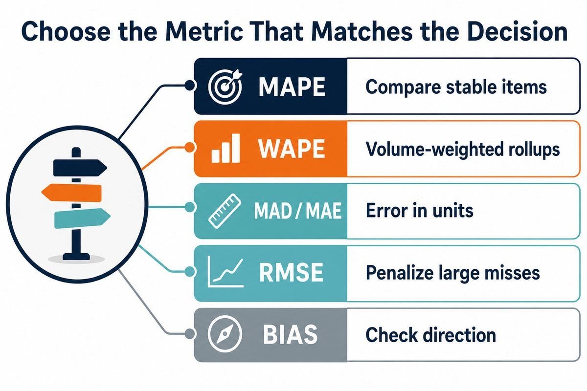
Choose the metric from the decision it feeds: WAPE for volume-weighted roll-ups, MAPE for comparing stable items, MAD for single-SKU conversations, RMSE for model tests where large misses cost most, and bias beside all of them.
In text form: use MAPE to compare stable items of different sizes; use WAPE for the family and business roll-ups that feed a monthly demand review process; use MAD when tuning one SKU with the people who plan it; use RMSE when evaluating models and large misses cost disproportionately; and read bias alongside every one of them to catch directional drift.
Two conversion warnings prevent most dashboard confusion. First, “forecast accuracy” as a percentage is usually 1 − WAPE or 1 − MAPE, and the two produce different numbers from identical data, so a target like “85% accuracy” means nothing until the formula underneath is named. Second, accuracy percentages can go negative when total error exceeds total demand, which is normal for new products and no reason to cap the report at zero.
Measure at the level where the decision is made
Aggregation moves every one of these numbers. Family-level errors offset item-level chaos: over-forecast product A by 300, under-forecast product B by 300, and the family scores near-perfect while the warehouse holds excess A and expedites B. The reverse trap also operates: SKU-week measurement makes a usable process look broken, because noise that pooling would absorb gets counted at full weight.
The rule that survives contact with practice: measure at the level and lag of the decision the forecast feeds. Production planning driven by a monthly family forecast should be scored on monthly family error, at the lag the schedule was frozen. Safety-stock decisions at SKU level need SKU-level error over replenishment lead time. Both measurements can coexist on one dashboard; averaging them into one number serves neither. How the forecast itself gets built, reviewed, and owned is the subject of the manufacturing sales forecasting process guide.
Fix the measurement window too. Compare actuals against the forecast version frozen when the decision was made, not the version revised after actuals arrived. Grading a forecast that was corrected mid-month reports the skill of the correction, not the forecast, and organizations weighing whether their planning process is ready for tighter financial integration face this question first when choosing between S&OP and IBP.
Forecast accuracy metrics FAQ
What are the three measures of forecast accuracy?
The three measures cited most often are MAPE, MAD, and forecast bias: percentage error, unit error, and direction of error. Most manufacturing scorecards now add WAPE as a fourth, because it fixes MAPE’s distortion on low-volume items while keeping the percentage format.
What is the best measure of forecast accuracy?
There is no single best measure, only a best pairing for a given decision. WAPE plus bias is the strongest default for manufacturers: WAPE weights error by volume so the headline number reflects real exposure, and bias catches directional drift that any absolute metric hides.
Is forecast accuracy a KPI?
Forecast accuracy works as a KPI only when the formula, aggregation level, and lag are fixed and published. An unlabeled accuracy percentage invites gaming through re-forecasting or level-shifting. Treat it as a diagnostic that triggers investigation, and pair it with service and inventory measures so no one optimizes the forecast at their expense.
How do you convert forecast error into an accuracy percentage?
Subtract the error percentage from 100%: an 8% WAPE reports as 92% accuracy. Label which error metric sits underneath, because 1 − MAPE and 1 − WAPE differ on the same data, and note that the result can legitimately fall below zero when total error exceeds total demand.
Next steps
Three moves put this into practice in one planning cycle:
- Pick the pairing per level: WAPE plus bias for family roll-ups, MAD plus bias for the SKUs that carry your service risk.
- Freeze the forecast version at decision lag, and label every dashboard with formula, level, and lag.
- Recompute last quarter with the new definitions before setting targets, so the baseline reflects the metric, not a hope.